


I’ve always loved high-key images for their simplicity, elegance, and power. There’s a directness to them and no confusion at all about your intended subject. The technique is relatively simple, and yet for all its advantages, it’s been a while since I’ve thought to embrace it. Going into my recent trip to Kenya, I decided to remedy that by looking for opportunities to mix up my portfolio and go high-key, and I thought that might make for an interesting Sunday morning conversation with you.
We’re a long way from the roots of the term high-key, which seem to come from film/TV. In early days, high contrast scenes didn’t translate well to the medium, so lighting ratios between the “key” light and the “fill” light were kept quite low or “low-key.” High-key, as you might guess, is the opposite.
These days, high-key is as much a stylistic term as a technical one—a catch-all for a particular kind of look characterized by light tones and without dominant dark shadows.
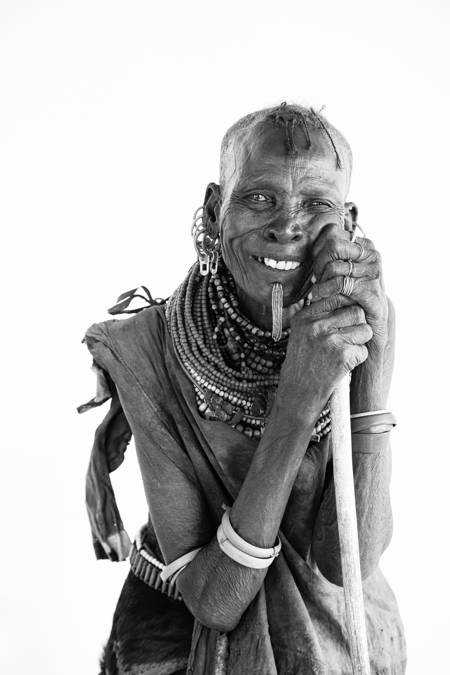
The images that accompany this piece are considered high-key, set against a clean white background where the subject matter takes not just center stage but the whole stage. This isolation makes whatever you’ve chosen as your subject do all the work. It’s the perfect choice if you’re trying to showcase personality (or colour and texture), which is probably why Richard Avedon chose to use this approach in his portraiture. I took a similar approach in Kenya years ago when photographing the Rendille, Samburu, and Turkana cultures, and it’s work I’m still proud of. It’s not clever. It requires very little technically, but demands greater sensitivity to your subject and the moment.


The, uh, key to this kind of work is a featureless background that is brighter than your subject. Or, look at it the other way: your subject is darker than your background.
So when you expose for your subject, your background gets brighter. It might blow out completely (and it might not), but that really doesn’t matter because background details aren’t usually the point in an image like this, so blowing them out and losing those details only helps accomplish that isolating effect. The greater the difference between the tonal range of your subject and your background, the easier this is. Black bird against white sky? You’re going to have to bump the exposure up to get all the details and colour in those feathers, and the background sky can just blow out, especially if it’s one of those overcast grey days.
Being open to high-key possibilities also solves a common problem when you’re shooting outside: bright sky, dark subject. You could also silhouette the subject, I suppose, but sometimes the photograph isn’t about the shape of a silhouetted subject, or the brighter background itself isn’t very interesting. Shaded in the tree, this leopard is in the perfect situation for a high-key shot. Expose for what matters (the leopard) and don’t worry about overexposing the sky; that’s not a problem, it’s an opportunity. The same is true with the Bateleur eagle, and others below.


When searching for high-key opportunities, I’m looking for grey, featureless skies and an angle on the subject that keeps it shaded or out of brighter ambient light to increase the tonal difference and make it easy to bump up the exposure on the subject and blow out the background (preferably in-camera, but some of this can be done in Lightroom as well). Of course, pure white backgrounds don’t print well. We generally want some ink coverage on the paper, so before printing, I’ll pull the white point down a bit in Lightroom. The images below show this well. The image on the left is blown out and developed nicely, but won’t print as well as it would if I used the tone curve and pulled the whites back a little (right). Showing the image against white will help you see the difference.


Shooting scenes like this once in a while might be good for those of you who always keep a nervous eye on your histogram as if the one great unpardonable sin of photography is blowing out a highlight.
You don’t want to blow out highlights where the loss of detail would detract from the image. But purposely letting go of them in order to gain something better—like the power and elegance of a clean white background—will give you a new approach to your photographs and help free you from some of the “shoulds” and the “ought nots” of this craft.
Give it a try, let me know how it goes.
I’m currently in Zambia, so while I welcome you to leave questions and reactions to these ideas in the comments below, I’ll be in the bush for another two weeks or so, so please be patient if I don’t respond right away.
For the Love of the Photograph,
David