


Right from the very beginning, I was never a fan of the display notch trend that took hold of the smartphone industry starting around 2017. While next-generation punch-hole selfie camera cutouts proved an aesthetic step up, they too felt quirky when compared to the uninterrupted display real estate of yesteryear’s handsets.
Then, everything changed when Apple unveiled its Dynamic Island back in 2022. Rather than obfuscating the front-facing punch-hole, the company leaned into it with added functionality. Suddenly, what was previously a blemish transformed into a centerpiece, capable of expanding and contracting to show and hide various status elements, system states, and more.
Ever since Dynamic Island’s fateful unveiling, I’ve been secretly jealous of it as an Android user. I love the idea of having a dedicated space near the top of my phone for alerts and for basic multitasking, and the concept itself brings back fond memories of the LG V10 and the HTC U Ultra –earlier experimental Android phones with display tickers of their own.
Material Capsule is far from a Dynamic Island clone
The app takes things to the next level by invoking the spirit of Android
Now, it’s true that Dynamic Island-esque apps have existed on the Android platform for some time now, with notable examples like dynamicSpot and NotiGuy springing to mind. That being said, it’s taken me until now to delve into this unique world, as I’ve always been weary of leaning too far into ‘iPhonizing’ my Android phone.
Boy, was my concern unfounded.
I ultimately settled on the Material Capsule application, and within a few short minutes, I swore to myself that I’d never go without it on any future Android phone I decided to carry. The app takes inspiration from Apple, to be sure, but it does its thing in a distinctly ‘Android’ way that feels like the perfect blend between the two mobile platforms.
Material Capsule is available to download and install for free right from the Google Play Store. A small single-time payment is required to unlock the app’s full functionality. While the free version doesn’t have any ads, it does limit you to only a couple of dynamic software elements at any given time.
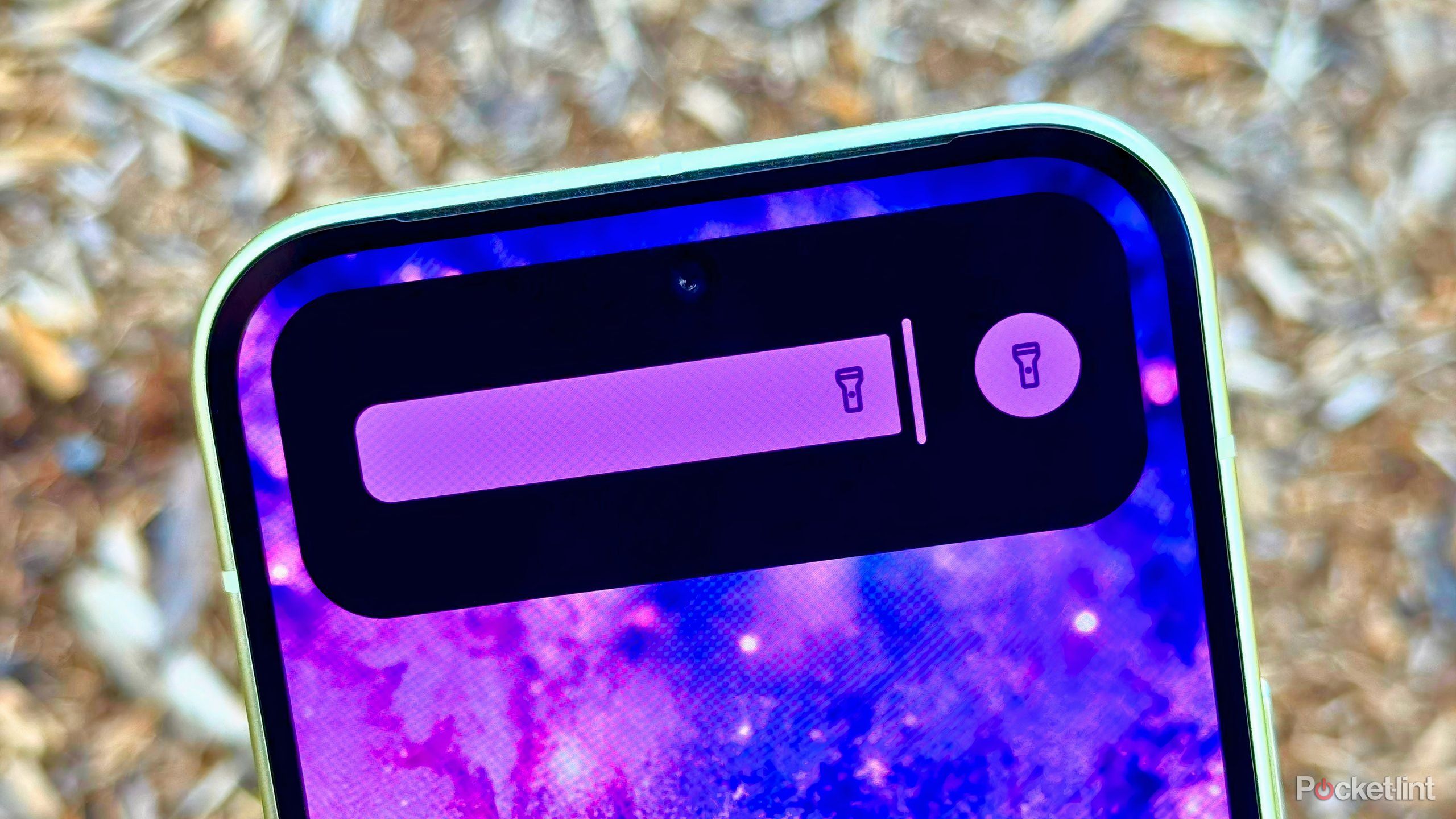
At a basic level, Material Capsule emulates the iPhone’s expandable card system through its own ‘Mini Capsule Events’ and ‘Dynamic Cards.’ The former are small snippets of information that live within the selfie cutout itself, while the latter are expanded cards that offer additional buttons, controls, and relevant information.
All the essentials you’d expect to see are here, including charging status, music playback, volume mode, timer progress, and even a flashlight intensity slider ( beating Google to the punch on that front). Plenty of unique options are also present, such as indicators for Google Play Store download progress, USB device mount status, and current battery temperature.
Material Capsule goes a step further, however, with its Card creator tool, letting you map custom shortcuts, sliders, and even barcodes to the capsule itself. There’s also a gesture system here, letting you long press, double tap, or swipe left and right across the capsule to launch apps or initiate actions.
What I love most about Material Capsule is that it embraces the fact that it’s an Android application.
What I love most about Material Capsule is that it embraces the fact that it’s an Android application. The app follows Google’s Material 3 Expressive design language, it dynamically adapts to the color of your wallpaper, and it cheekily gives you the option to toggle between ‘Like a Robot’ and ‘Like a Fruit’ within its settings page to configure animation style.
The app also nails the fundamentals, with no glitchy behavior, an easy-to-understand and organized configuration flow, and a privacy-conscious design that doesn’t ask for permissions aside from what is strictly necessary (the AccessibilityService API for drawing over other apps). The setup flow is also easy and communicative, and there’s plenty of control over the capsule’s size and position to ensure compatibility with the entire ecosystem of Android punch-hole hardware.
With its smoothness and its genuine utilitarianism in mind, I plan on keeping Material Capsule running on my Google Pixel 10 for the long run. The app looks and feels as though it was made by Google itself, which is perhaps the best praise I can give it. Sure, interacting with the cutout invariably leads to a smudged front-facing camera, but I’m far more likely to want to check my battery status or to quickly skip music tracks than I am to take a selfie, anyway.