


When it comes to tweaking picture settings on a TV, colors don’t necessarily get the attention they deserve. The focus tends to be on factors like brightness and motion smoothing, and if colors do come up, it’s liable to be about addressing issues with tint or HDR. I’m sure I don’t need to tell you, though, that washed out colors can be as much of a problem as anything — they can make a movie look bland, or downright ugly.
I should say here that this problem isn’t necessarily a result of settings. In some circumstances, it could be a panel defect, or simply a matter of perspective. TV makers often use exaggerated defaults to attract store shoppers, so anything else might look weak by comparison, no matter if it’s what a filmmaker intended. If neither of these explanations sound likely, here are a few tricks you can try to remedy the situation.
Picture modes
The shotgun solution

This may be the quickest option, but it’s not necessarily the best. The issue is that picture modes are really just presets that change multiple settings at once. So while they may solve issues with colors being washed out, you might also skew other image qualities in a way you don’t like, say by boosting sharpness too high.
You’ll have to experiment with modes to see which one works best for you. Beyond the fact that options can vary between brands and software platforms, they frequently look different from TV to TV, depending on their panel technology and the specific components used. My Hisense U68KM, for instance, has “Theater Day” and “Theater Night” modes that I’ve never seen on previous TVs I’ve owned, and I actually find Theater Night preferable round-the-clock, despite its name.
Modes can vary between brands and software platforms, and frequently look different from TV to TV, depending on their panel technology and the specific components used.
I would suggest staying away from any energy-saving modes (more on this in a moment), as well as Dynamic and Vivid options. The latter two are those exaggerated defaults I was talking about earlier, and often go too far in the opposite direction, committing sins like oversaturating colors and ramping up contrast. They may also increase sharpening and turn on motion smoothing, neither of which you probably want.
Something you can do is set a mode that looks at least partway satisfying, then adjust individual picture settings until it suits your tastes. Some of the tips below may help you on that point.
Disabling any energy-saving features
Your ultimate nemesis

Ordinarily, I’m a big fan of energy-saving features on my devices. I don’t use them constantly, but they’ve saved my bacon a few times when working remotely from my laptop, or trying to keep my iPhone or Apple Watch useful by the time I touch down from a long flight. When it comes to TVs, though, I switch these options off immediately.
Why? While they can lower your power bill slightly, they sabotage image quality in a way that just isn’t worth it. In general, they work by lowering contrast, brightness, and/or backlighting levels, which can easily result in washed-out images. At best they adjust these elements automatically, based on ambient light — but more often than not, they err on the weak side, depriving people of the picture quality they paid for.
While they can lower your power bill slightly, they sabotage image quality in a way that just isn’t worth it.
You may need to explore settings menus to discover where these features are. While some TVs may include them under Picture options, others may slot them under categories like General or System. Their naming can vary, too. You may see labels like “Eco Mode” or “Adaptive Brightness” instead. The better way to deal with brightness is to watch a dark scene under normal lighting conditions, then raise or lower levels until the faintest shadow details are barely visible. If you get this right, you may rarely ever need to touch brightness again.
Contrast and saturation
Getting to the root of it all

If you’ve already found a picture mode you like and disabled any energy-saving features, you may still need to spend some time fiddling around with contrast and saturation levels. Contrast is nominally the gap between bright and dark parts of an image, but by extension, it affects colors as well. Low contrast may be directly responsible for your screen looking washed out.
The same goes for saturation. In short, saturation describes how pure and intense colors look, so it stands to reason that lower values will appear diluted. Think of it like mixing white or gray into a color when you’re painting.
It’s possible to overdo things, though, in just the same way Dynamic and Vivid modes tend to. Oversaturated colors may look impressive at first, but they can destroy detail, or ruin the effects of deliberately desaturated scenes. Excessive contrast can harm detail in its own way, and result in inaccurate colors, for instance tinted blue or green.
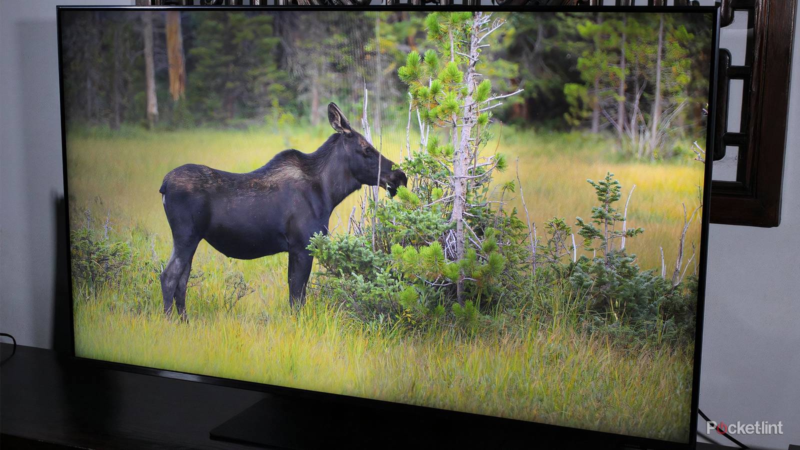
What I’d recommend is starting with Filmmaker Mode, which is deliberately neutral, then playing with contrast, saturation, and other color settings while you watch a favorite movie or TV show. You should be able to find a combination that works across every scene, producing “pop” without killing all subtlety.
Black, RGB, or Deep Color ranges
Don’t forget chroma subsampling while you’re at it

On the surface, these terms might seem unrelated, but what they share in common is that they affect the number of colors your TV is producing. With RGB range, for instance, many TVs and other devices are geared towards limited values between 16 and 235. If a source is producing the full range — 0 to 255 — when input settings are limited, blacks may be interpreted as gray, leaving you with that washed-out effect. As a rule, you should search for options like “RGB Range” or “HDMI Black Level,” and make sure they’re set to automatic or limited for sources like media streamers and Blu-ray players. The full range should only be enabled for connected consoles and computers.
For HDR formats to display the full range of colors they support, Deep Color needs to be set to 10-, 12-, or 16-bit.
With any source playing HDR content, make sure HDMI Deep Color is set to the right level. For HDR formats to display the full range of colors they support, Deep Color needs to be set to 10-, 12-, or 16-bit. Leaving inputs at 8-bit may not result in images looking washed out in a dramatic way, but colors will appear a little “richer” once you bump up to 10 bits or higher.
If your TV or devices offer the choice, you may want to adjust chroma subsampling. This is a compression technique that shrinks color data. Realistically, you may not notice much difference, but changing from 4:2:0 to 4:2:2 or 4:4:4 (zero compression) will technically get you better color accuracy and detail. If you’re going to notice it anywhere, it’s probably with a connected console or computer rather than your Roku stick.