


Google Wallet received a notable redesign last year, with Google bringing Android 16’s Material 3 Expressive design to the app and modernizing its look with more rounded corners, smoother animations, and dynamic color themes. That said, the update didn’t fundamentally change how Google Wallet worked — it was more of a fresh coat of paint than a true overhaul.
This year, though, it looks like Google may finally be giving its popular wallet app the proper redesign it deserves, and that is long overdue.
In a recent APK teardown, the fine folks over at Android Authority discovered that Google is working on a new user interface (UI) for Google Wallet that makes it much easier to access your favorite cards and passes on the home screen.

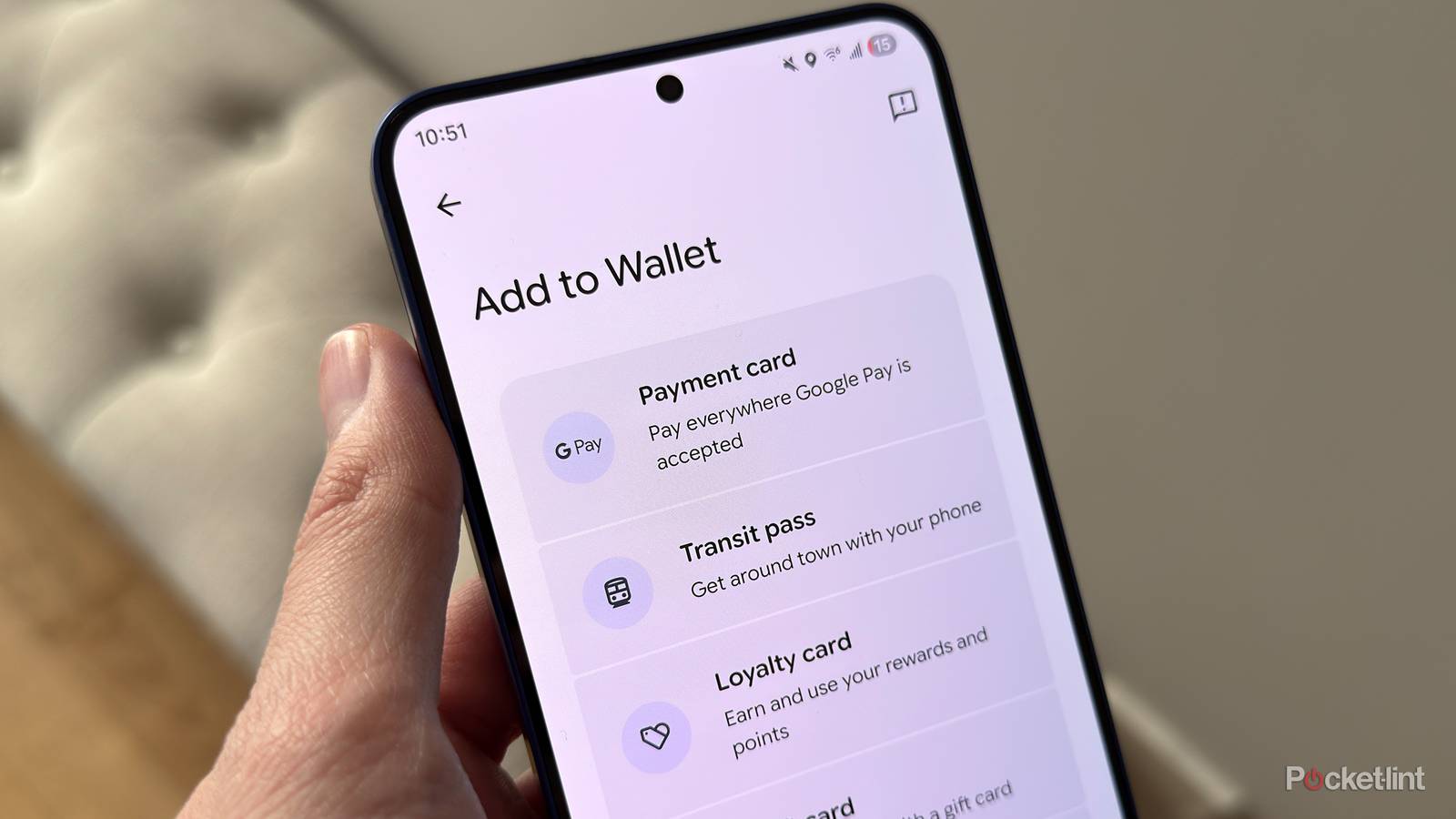
Right now, Google Wallet displays all your cards in a simple list view. With this upcoming update, however, Google plans to switch to a grid-style layout that shows your favorite cards or passes front and center as soon as you open the app.
By default, Google will automatically favorite four cards for you, but you can easily add or remove favorites yourself. Just select a card and tap (or untap) the star icon in the top-right corner. Once a card is favorited, it gets its own dedicated tile on the home screen, making it quicker and easier to pull up when you’re ready to use it.
- Developer
-
Google
- Subscription cost
-
No
Google Wallet’s new UI is still a work in progress
Its release date is unknown

While this redesign of Google Wallet is exciting, it’s important to note that it is still a work in progress, so things could change before release, and also, it’s unclear when or if Google could actually roll this out. But hopefully it’s sooner rather than later.
Personally, I’ve never been the biggest fan of Google Wallet’s current list-style layout for cards, so seeing this new grid-style UI that could be coming is certainly promising, and I think it will give the app the much-needed overhaul it’s been needing. Don’t get me wrong, I like the Material 3 Expressive redesign it got last year, but this update would actually make the app easier to use rather than just looking nicer.
I like the concept of being able to favorite specific cards and having them pinned to Google Wallet’s home screen. Based on the screenshots Android Authority took, it seems like it will be quite colorful too, so you’ll be able to differentiate between your cards and passes quite easily.
Additionally, for any cards you don’t want to pin to the home screen, there will be a “View more” button at the bottom of the screen that you can tap to view the rest of the cards and passes you have stored in your wallet. Personally, I use four cards primarily, so I’ll probably keep those front and center and leave the rest on the other screen for whenever I need them.
Again, there’s no indication of when this update will roll out, so it may still be a number of months before Google releases it, or it may even be waiting for Android 17.
There are also a couple of other much-needed changes coming to Google Wallet soon that are reportedly in the works, including the ability to view all your transactions in the app regardless of the device you made them on, and the ability to search for specific transactions. Google also recently rolled out its Nearby Pass Notifications feature, which gives you a notification to use a specific pass in your wallet when you’re in a particular area, such as your boarding pass at an airport, train tickets at the train station, or a loyalty card for a coffee shop you regularly visit.