


Summary
- As first spotted by Android Authority, Google appears to be testing a new phone answering interface for its Phone by Google app.
- This in-progress redesign brings the app into better alignment with Material You Android interface guidelines.
- The update replaces an up-down gesture with a left-right interaction model for declining and answering incoming phone calls.
Ever since debuting its Material You design language starting in 2021’s Android 12 release, Google has been on a quest to update all the components of its OS to better align with the company’s all-new visual style.
As reported by Android Authority in a recent under-the-hood Android APK teardown, Google appears to be targeting its first-party phone dialer app next for a visual refresh. Specifically, the company is working on an overhaul of the incoming call interface — a piece of UI that could certainly benefit from a fresh coat of paint.
Right off the bat, the most notable difference comes in the form of themeing — the plain white or black incoming call screen makes way for a dynamically colored experience, which adapts to your current wallpaper and corresponding accent color pallet of choice.

Related
Lock screen widgets are returning to Android, and it’s been a long time coming
Google is re-implementing lock screen widgets as part of Android 16, but the company should have never ripped the feature out of the OS to begin with.
The other major tweak comes in the form of an updated interaction model for answering or declining phone calls. When a call is received on or another Android device with the Phone by Google app preinstalled, the interface is flanked by a swipeable phone gesture icon. The updated app experience switches out the up-down gesture for a left-right one.

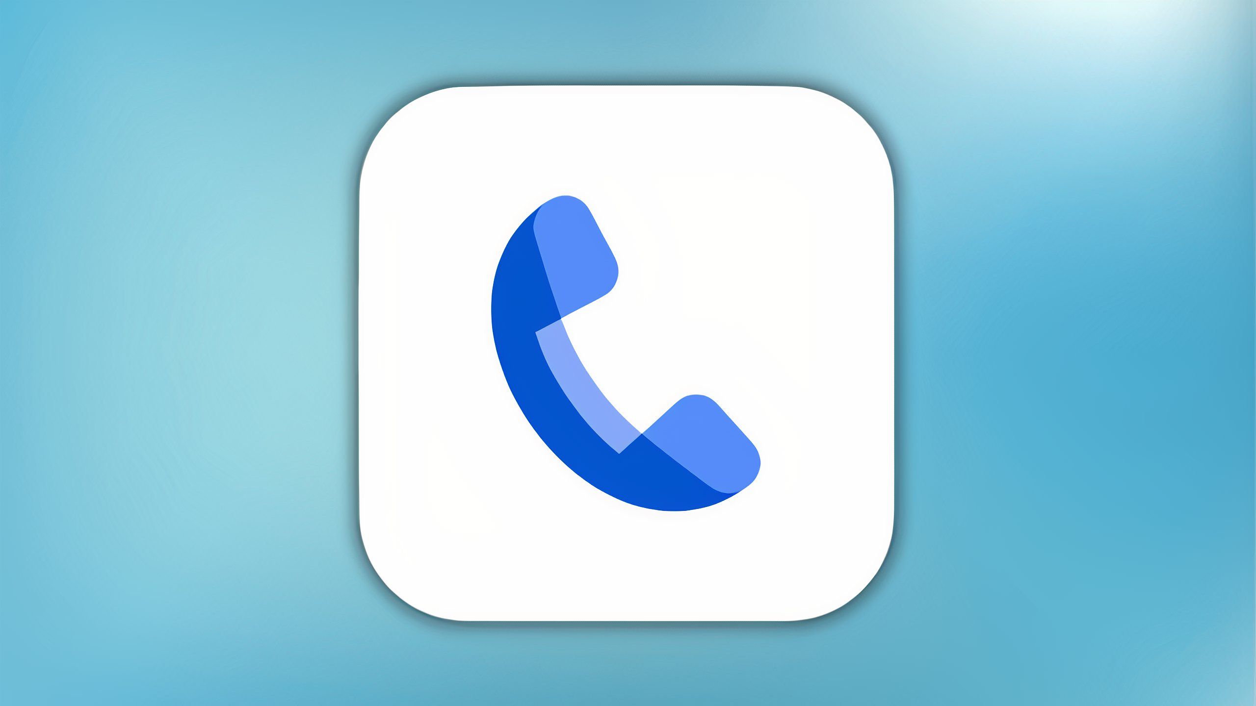
Phone by Google
Google’s first-party dialer that ships on Pixel handsets, the Phone app comes with useful AI features like Call Screening that help combat spam calls.
Google’s new phone call interface is a step in the right direction
The Material You design language continues to permeate all corners of the Android OS

Android Authority
Android’s current Material You design aesthetic has proven somewhat controversial — some argue that as a design framework, it makes poor use of space. Others feel that the pastel color palette chosen by Google lacks the vibrancy and punchiness of other third-party Android skins, and that corners are horrid in their inconsistency.
Personally, I’m a fan of Material You in its current form. I appreciate that the aesthetic is visually consistent, and that it goes its own way as opposed to emulating Apple’s software design language.
Based on these early screenshots, I think Google has done a solid job of refreshing its default call interface design. It certainly fits in with other parts of the Android OS, and it’s great to see the company focus on smaller UI details and consistencies.
Personally, I’m a fan of Material You in its current form.
We might not make many phone calls on our devices these days, but an operating system’s entire user interface is elevated when a consistent design is employed across any and all surfaces (unbeknownst to Microsoft’s Windows 11).
Of course, Google hasn’t yet confirmed plans to refresh its dialer app, and it’s clear that this redesign is still a work in progress. As such, there’s no telling when we’ll see the update get pushed out in any official capacity or whether the company will make further changes to the interface ahead of its rollout.

Related
Encrypted RCS messaging coming soon to iPhone-Android chats
RCS messaging between iPhone and Android users is about to get more secure.