


Colors aren’t just visual elements in your photos; they evoke emotions and tell a story. Mastering the basics of color theory can elevate your photography from good to breathtaking.
The magic of the Color Wheel
Imagine a rainbow transformed into a circle – that’s the color wheel! It’s your key to understanding color relationships.
- Primary Colors: Red, Yellow, and Blue are the building blocks. Mixing them in various proportions creates all other colors.
- Secondary Colors: Green (yellow + blue), Orange (red + yellow), and Purple (red + blue) sit opposite the primary colors on the wheel.
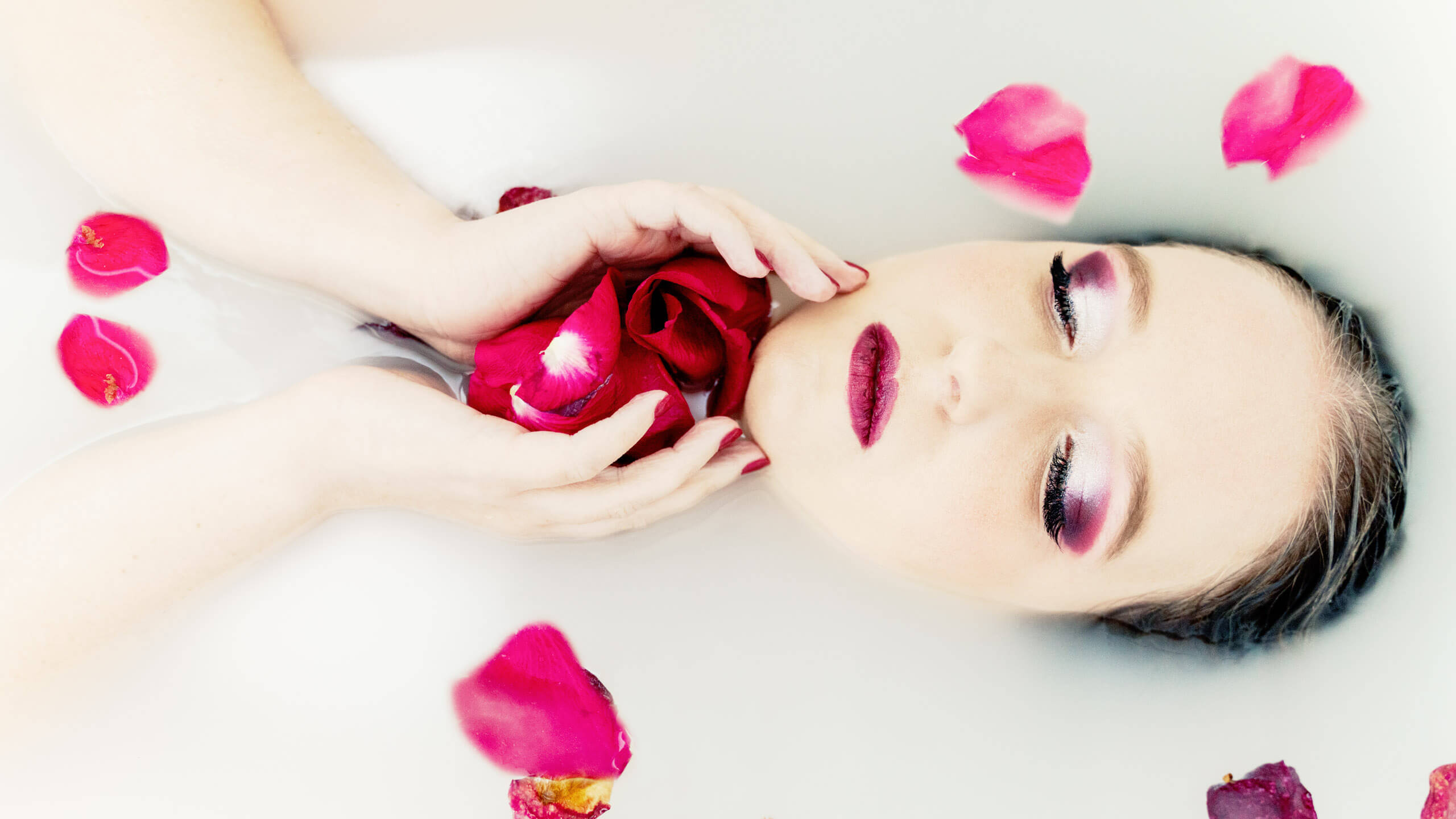
- Complementary Colors: These are directly opposite each other on the wheel (e.g., red and green, blue and orange). They create a high contrast and dynamic tension when used together, perfect for grabbing attention.

Beyond the basics: Color harmonies for different moods
There’s more to color than just opposites! Explore different color palettes to evoke specific emotions:
- Analogous Colors: Colors next to each other on the wheel (e.g., blue, blue-green, green) create a sense of harmony and tranquillity. Ideal for landscapes and calming portraits.
- Triadic Colors: Three colors evenly spaced on the wheel (e.g., red, yellow, blue) create a vibrant and energetic feel. Use them for action shots or high-impact compositions.
- Warm vs. Cool Colors: Warm colors (reds, oranges, yellows) evoke feelings of energy, passion, and joy. Cool colors (blues, greens, purples) suggest calmness, peace, and serenity. Use them strategically depending on the mood you want to convey.

Color in action: Putting theory into practice
- Highlight your subject: Use a contrasting color background to make your subject pop (e.g., dress in red against a blue background).
- Create emotional depth: Use warm colors to evoke happiness or cool colors for a sense of mystery.
- Color storytelling: Use contrasting colors to highlight a conflict or similar colors to create a sense of unity.
Color in editing: Take your images to a new level
You’ve captured a stunning composition, mastered the exposure, and nailed the focus – but your photo still feels a little…flat. This is where the magic of color grading in post-processing comes in! While capturing great colors in-camera is crucial, editing software allows you to fine-tune your image’s color palette, add a touch of artistry, and truly elevate it to a new level.

Unlocking the power of color grading
Color grading is more than just adjusting saturation. It’s the art of manipulating the colors in your image to create a specific mood, enhance realism, or add a touch of creative flair. Here are some ways to achieve this:
- Balancing colors: Sometimes, a simple white balance adjustment can make a world of difference. Correcting for unwanted color casts can reveal the true colors in your scene.
- Selective color adjustments: Editing software allows you to target specific color ranges within your image. For example, you can enhance the vibrancy of the blue sky while keeping the skin tones natural.
- Color split toning: This technique applies a different color to the highlights and shadows of your image, creating a subtle or dramatic effect depending on your choices.
- Creative color grading: Experiment with advanced color grading tools to create unique looks. Play with color curves to adjust specific tones in the image, add color tints, or even replace certain colors entirely.
Finding your editing style
- Emulate Cinematic Looks: Many editing software programs offer presets inspired by popular movies or film genres. These presets can be a great starting point for achieving a specific cinematic look.
- Seasonal Inspiration: Draw inspiration from the colors of different seasons. Use warm tones for a summery feel or cool tones for a wintery mood.
- Tell a Story with Color: Don’t just grade for aesthetics! Use color to enhance the narrative of your image. Emphasize warm tones for a happy scene or cool tones for a suspenseful atmosphere.

Beyond the basics
- Local Adjustments: Utilize tools like brushes, gradients, and adjustment masks to target specific areas of your image for color adjustments. This allows for precise control over the color palette in different parts of your photo.
- Color Harmony: Keep in mind the principles of color theory when editing. Using complementary colors or analogous color palettes can create a sense of visual balance and harmony in your image.
- Color grading is a powerful tool, but like any tool, it needs to be used with moderation. Don’t over-edit your photos and lose their natural beauty. The goal is to enhance, not replace, the colors captured in-camera.
So, unleash your inner colorist and explore the world of color grading! With a little practice and experimentation, you’ll be taking your images to new levels of creative expression and visual impact.
Bonus Tip: Don’t be afraid to experiment! Explore color combinations that resonate with you and see how they affect the overall mood of your photograph.
Remember: Color theory is a powerful tool, but it’s not a rigid set of rules. Use your knowledge creatively to craft photos that are both visually stunning and emotionally