

Summary
- Amazon is reportedly testing a new Fire TV home screen layout, moving top apps from the navigation bar to lower down on the home screen.
- Responses to the new home screen layout have been largely negative on Reddit.
- Only a small subset of users have the new Fire TV home screen layout, and it’s possible Amazon may never roll it out widely.
If you’ve been using a Fire TV device for a while, like a Fire TV Stick, then you’re probably accustomed to Amazon changing the layout of the home screen every so often — sometimes much to the annoyance of its users.
Late last year, Amazon began testing a new home screen layout with a small subset of users, which changed the navigation bar, removing your most visited streaming apps from it and placing them further down the home screen instead (via AFTV News). This would make it a little more complicated to get to your favorite streaming apps quickly.
This new home screen layout was first seen in November of last year, and not much has been heard about it since — until now. A Redditor recently posted about their first-generation Fire TV Stick 4K receiving a new home screen layout, which is identical to the one seen being tested last year. It doesn’t appear that this new home screen has been rolled out widely, which means Amazon is likely again testing it with a small group of users.
According to AFTV News, Amazon often conducts small tests like this to gauge user reactions, so it’s possible it is once again considering adopting this new layout for all users. You can check out the original Reddit post below.

- Brand
-
Amazon
- Resolution
-
4K
- Audio codecs
-
Dolby Atmos
- RAM/storage
-
16 GB

Related
Amazon won’t tell you about this downside of owning a Fire Stick, but I will
The Fire TV Stick has a glaring issue.
Fire TV users aren’t pleased with the new home screen
Amazon might want to rethink this one

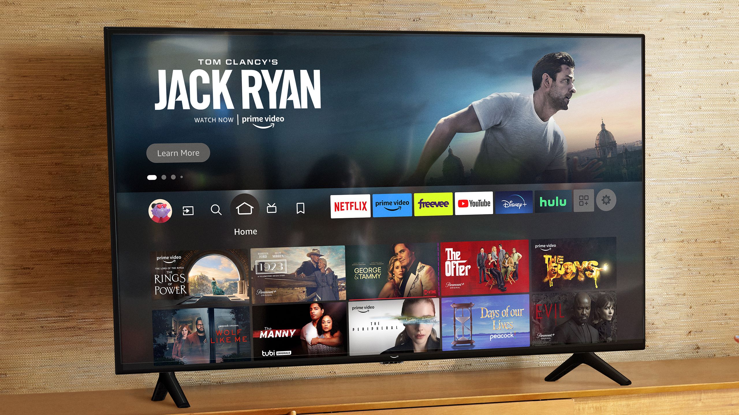
With this new home screen update, your top streaming apps are moved from the upper navigation menu to a lower position on the home screen, past a row of suggested content (as seen in the image above).
With your top streaming services moved lower down, the navigation menu now has ample blank space to the right, suggesting Amazon could have plans to add more navigation shortcuts, or worse, more ads. Currently, the navigation bar includes the home screen button, search icon, live TV, games, and My Stuff (your watchlist, purchases, rentals, and more).
User reactions to the Fire TV home screen layout are, so far, quite negative, based on responses on Reddit. One Redditor called the design “dreadful” and said that “the useful stuff that you want is not barely visible compared to all the recommendations which are just de facto advertisements.” Another Redditor referred to the update as making the Amazon Fire TV Stick 4K the “Amazon Advertisement Stick 4K.”
Another Reddit comment I saw states, “I would actually be sort of okay with all of this if the apps row were the top row.” I agree with this, and I would be more comfortable with this change if it meant I didn’t have to navigate past a row of content I don’t care about to reach my top streaming apps. This new home screen layout is still in testing, so it may not ever be rolled out widely. Based on user reactions online, Amazon might want to consider taking this one back to the drawing board.

Related
Amazon finally did something about piracy on Fire TV devices
Amazon has blocked several streaming app on its Fire TV devices that promote piracy.