Summary
- Apple’s Liquid Glass overhaul for iPhones, Macs, and other devices is generally welcome, but has some design choices that create usability problems.
- Users need the option to adjust transparency levels themselves, and Apple should fix the readability of its fonts, which sometimes blend in too easily.
- It could also stand to tone down the bounciness of its animations, which can be a little excessive or (in the case of unlocking an iPhone) look outright bad.
At its 2025 Worldwide Developers Conference, Apple made a big show of a design overhaul for all its operating systems, known as Liquid Glass. This makes many buttons, menus, and other items either translucent or transparent, showing more of what’s underneath. Often these items are floating and minimalist, with animations that make them stretch and bounce — hence the “liquid” part. Developers already have their hands on an early version of the tech, and if you want to try it too, public betas of iOS 26, macOS 26, iPadOS 26, watchOS 26, and tvOS 26should be out in July.
As a whole, I’m into it — it’s been a while since Apple’s software has had a new aesthetic, and any good interface tries to stay out of your way. But there are a few problems with Liquid Glass as it stands, all of which really deserve to be polished before the finished software updates arrive in the fall. These are the changes I’d recommend — hopefully someone at Apple is taking notes.
- Brand
-
Apple
- SoC
-
A18 Pro (3nm)
- Display
-
6.3-inch 1,206 x 2,622 pixel resolution 120Hz LTPO Super Retina XDR OLED, 120Hz, HDR10, Dolby Vision, 1000 nits (typical), 2000 nits (peak)
- Storage
-
128GB, 256GB, 512GB, 1TB
Related
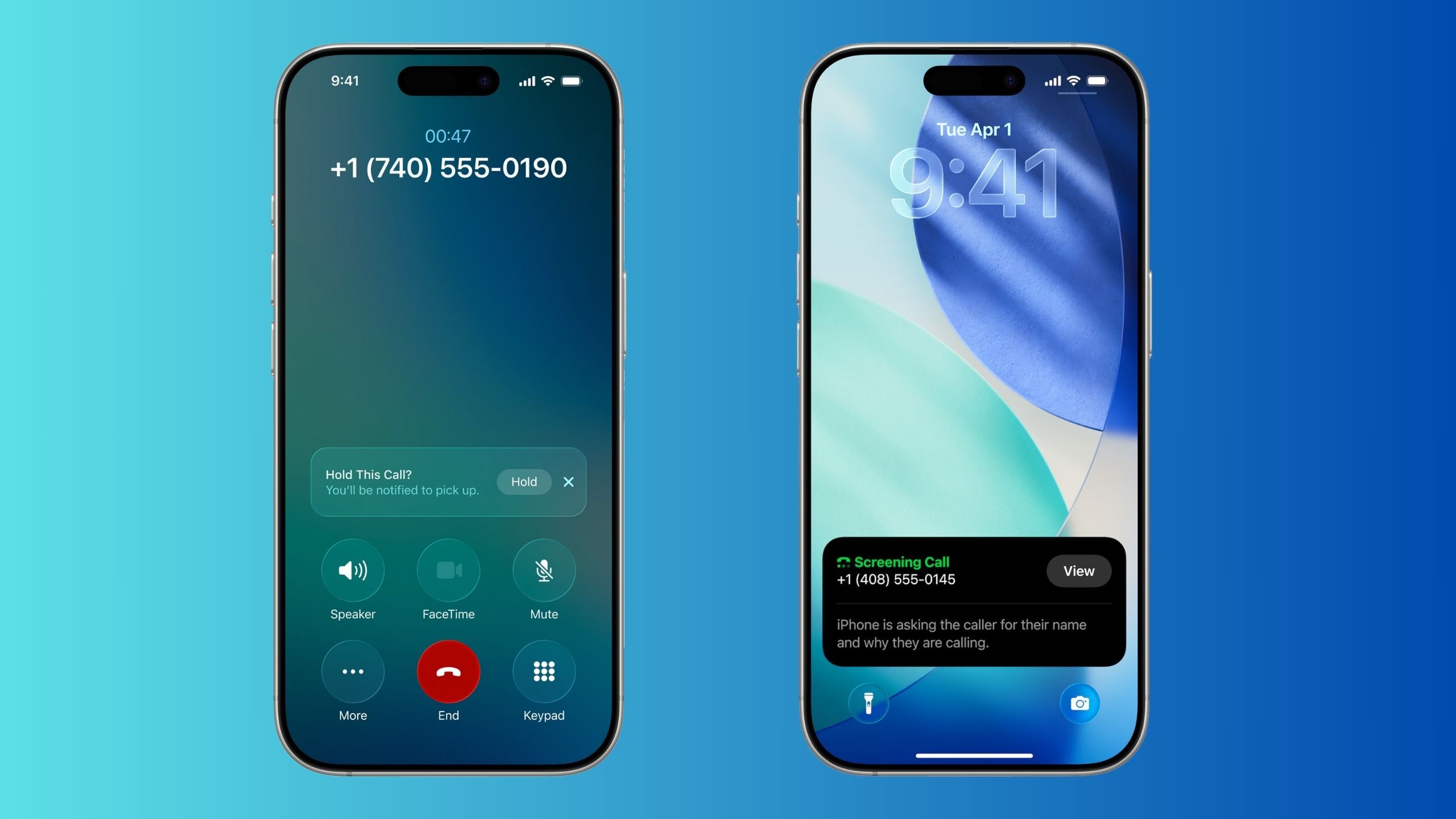
With iOS 26, Apple is finally taking the iPhone’s phone app seriously
By far, iOS 26’s most useful new features are Call Screening and Hold Assist — here’s why.
1
Put transparency levels on a slider
For app icons, if nothing else
Apple
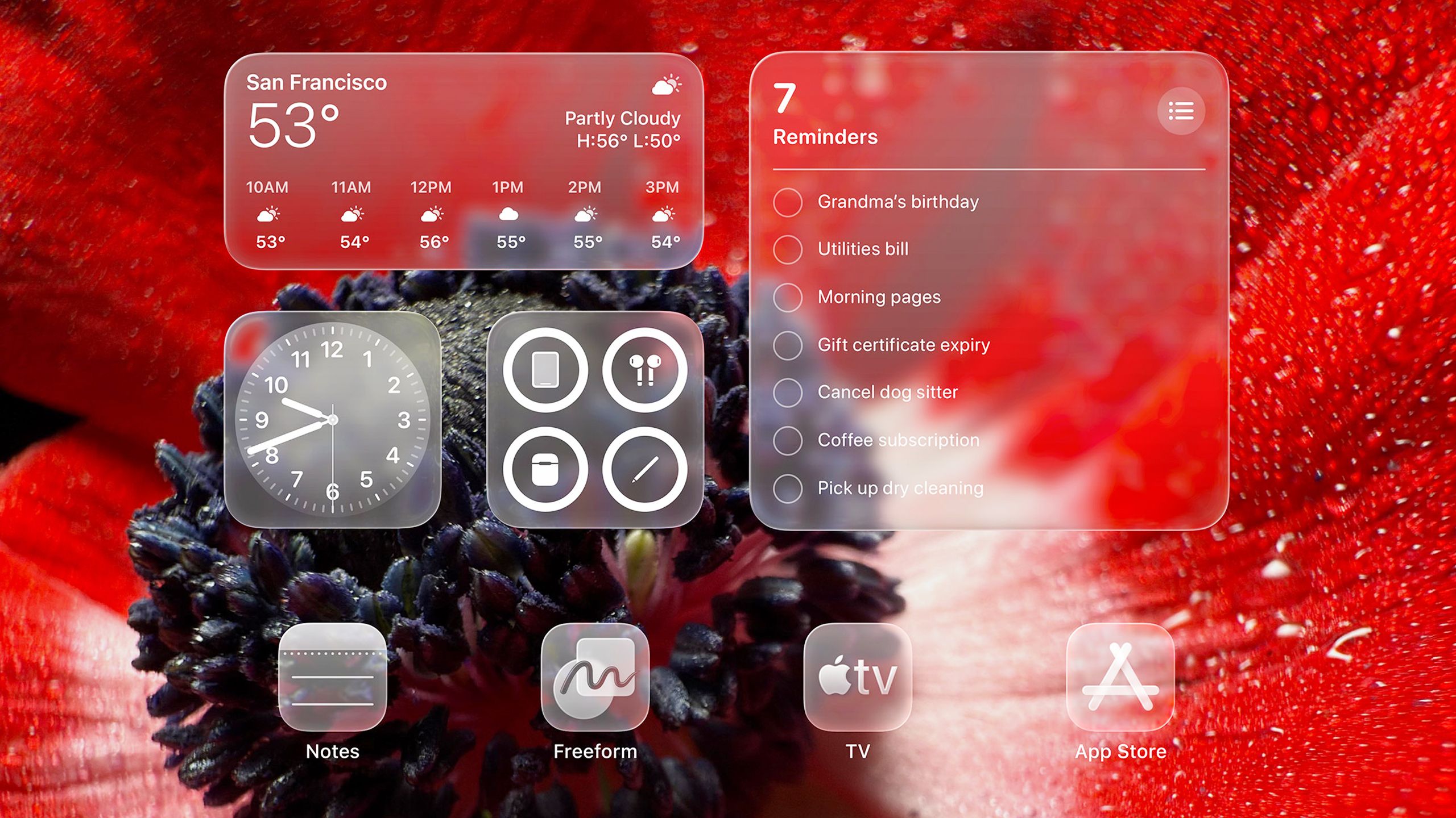
It makes sense for many things in Liquid Glass to be near or completely transparent, such as text selectors or the borders around tab menus. But sometimes this goes too far, such as in the case of the new Control Center, which can look like a jumbled mess depending on what’s in the background behind it. And if you choose the Clear icon appearance on your iPhone, iPad, or Mac, you may sometimes have to stare for a second or two longer to identify the app you’re searching for, or read data from a widget. There’s not much point in using a Reminders widget to see your daily tasks if it might be faster to open the app.
It would be nice to have clear icons without feeling like my iPhone and iPad homescreens are haunted by the spirits of dead apps.
In Apple’s defense, it was prepared for these concerns with a Reduce Transparency option. In iOS 26, it’s located under Settings > Accessibility > Display and Text Size. But all this does is add a darker background to items like the Control Center and app icons — some things are left untouched, and you’ll have to be happy with Apple’s definition of “reduced.” A better solution would be one or more transparency sliders, letting us decide just how clear we need things to be. I’d at least like to be able to control icon transparency — it would be nice to have clear icons without feeling like my iPhone and iPad homescreens are haunted by the spirits of dead apps.
Related
5 display calibration settings that will level up your game for free
The display tech you use for gaming can matter (almost) as much as the system you’re playing on.
2
Fix font sizes and colors
Readability is basic
Apple / Pocket-lint
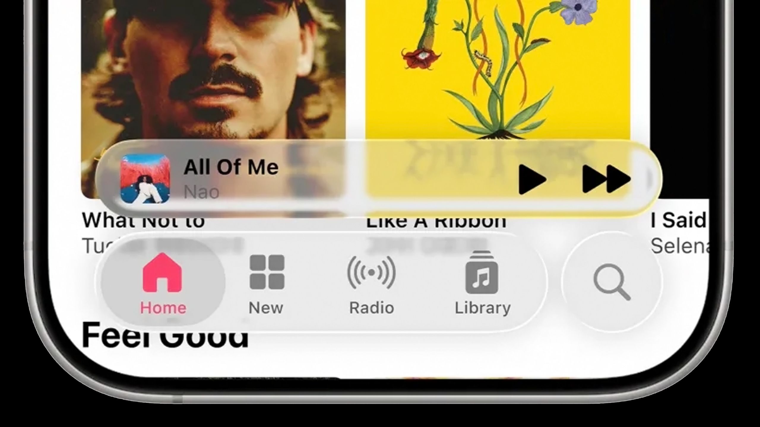
Something critics have been quick to notice — myself included — is that Apple is making odd choices with text in some places. If you’re playing a song in Apple Music, for instance, the artist name in the iOS 26 miniplayer is a light gray, making it blend in all too well with the surrounding menu. Even black or dark gray text on Liquid Glass buttons can sometimes be hard to read, once again depending on what’s in the background.
Perhaps the worst situation involves the Notification Center — if you’ve got light-colored wallpaper, the default white text of your notifications can be illegible, almost blinding. Here Apple’s choices seem explicitly aimed at making Liquid Glass look cool, rather than usable.
There are a few ways Apple could solve this problem, the most basic being to swap font colors where necessary, and bold button labels so they stand out no matter what. I shouldn’t have to turn to Accessibility settings as a crutch. Perhaps colors could be made dynamic, enhancing contrast on the fly.
These details are the sorts of things I’m expecting Apple to tweak before the fall. But there might also be a strong case for Apple to finally offer a built-in way of editing system fonts, across all platforms — there should be some level of flexibility that won’t risk breaking apps or violating house style.
Related
4 ways I get the most out of Google Maps in CarPlay and Android Auto
It’s worth putting a little more work into the app that takes you everywhere.
3
Tone down the new animations
Bounce, bounce, bounce
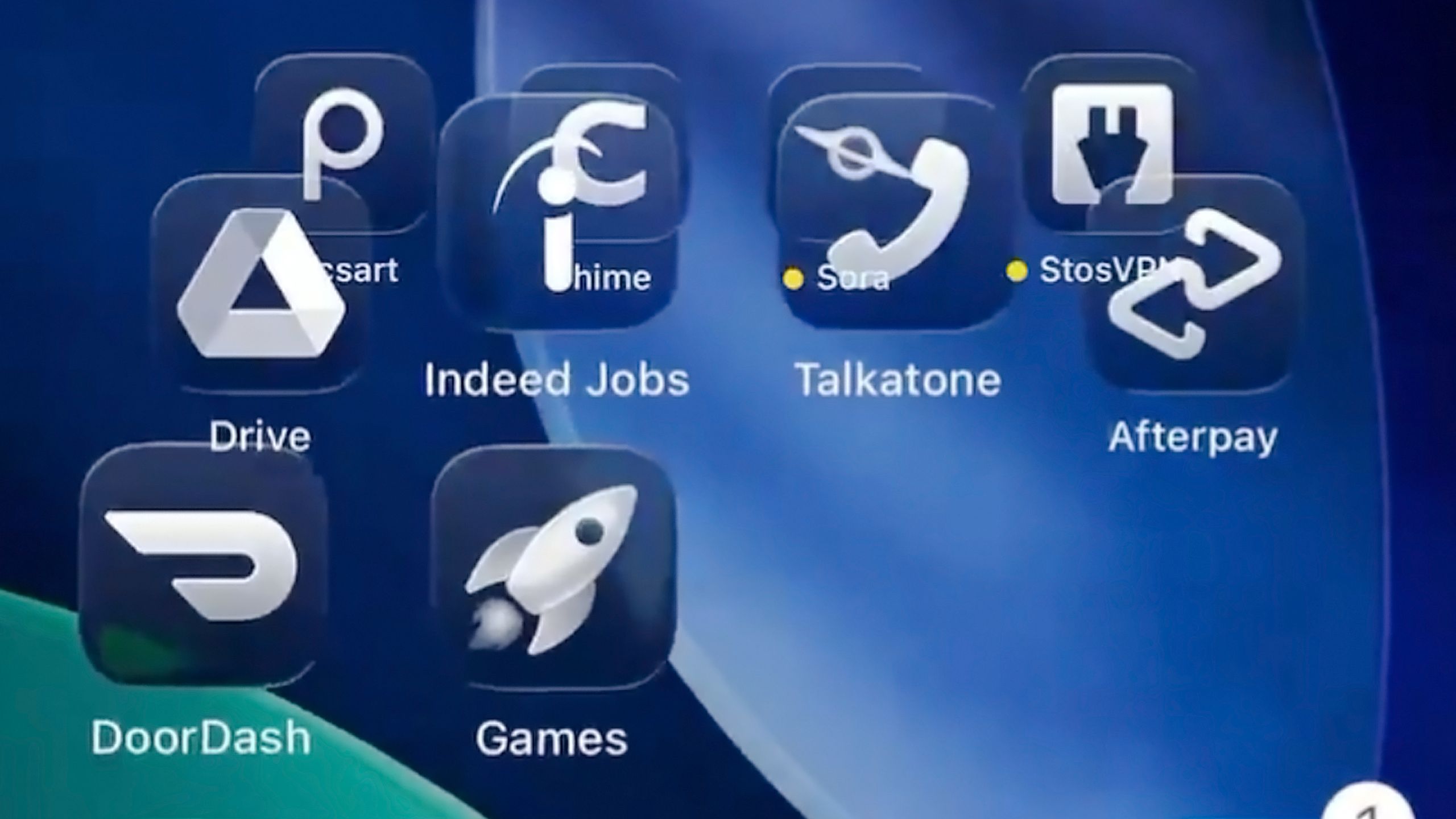
At the moment, Liquid Glass is very bouncy, with interface elements sliding, popping, and glooping around. It’s not a bad thing overall, but it can be a bit excessive occasionally, even cartoonish. Perhaps the worst example is the transition from the iOS 26 lockscreen to the homescreen — icons bounce so much that they fly over (and through) each other. You’d think there was an invisible trampoline.
The animation also takes long enough that it might stop you from launching an app for a second or two, though you could make a similar complaint about iOS 18. Regardless, I’m not a toddler watching YouTube videos — I don’t need constant motion to keep me entertained.
I’m assuming the lockscreen transition will probably be scaled back, and that users will be able to nix some or all of these animations using Accessibility settings. Otherwise, though, I doubt there’s much in the way of change coming. Reducing the amount of bouncing and morphing in any serious way would undo the liquid part of Liquid Glass — and for marketing, advertising, and development reasons, Apple is probably locked into that for a long time.
At the earliest, I wouldn’t expect any revamps until the next round of major OS updates, inevitably getting their preview at WWDC 2026. Changing course wouldn’t be completely unprecedented. In fact, consider how much Apple is downplaying Apple Intelligence this year, when it was hanging everything on it in 2024. The company is never so stubborn as to harm its bottom line or destroy its reputation.
We’ll have to wait and see how the general public reacts to Liquid Glass. If it’s the butt of jokes on late-night talk shows this fall, some sort of action is guaranteed.

You might also like
Everything you need to know about PEVs, or personal electric vehicles
You can use PEVs like e-bikes and scooters to explore, run errands, or speed up your commute.


