Summary
- When Google first unveiled its new Material 3 Expressive design language to the world, I wasn’t sold on the new look.
- Google describes Material 3 Expressive as a major design evolution for the Android OS.
- After testing out the redesign on my own Pixel phone, I came away genuinely impressed.
When I first laid eyes on Material 3 Expressive, Google’s all-new visual design language for Android, I made no secret of the fact
that I was unenthused
. At first glance, it felt to me as though Google was flying too close to the sun in its emulation of iOS, One UI, OxygenOS, and other operating systems that make liberal use of overlay blurs throughout their interfaces.
By contrast, I’ve always enjoyed using my Pixel 9 Pro (
and previously, my Pixel 5
) precisely due to the lack of visual blur seeping into the interface. Starting with Material You in Android 12, Google managed to craft a set of digital surfaces that, to my eyes, look attractive through the use of color tinting, while also maintaining a sort of distinctly opaque quality to them.
With this next-generation Android redesign, which Google describes as more expressive than previous efforts, the company is also making the seemingly strange decision to mismatch shapes within the new quick settings pane. I wasn’t sold on this new design element, either — the contrasting corner radii are visually peculiar, much to the chagrin of symmetry-oriented internet users the world over.
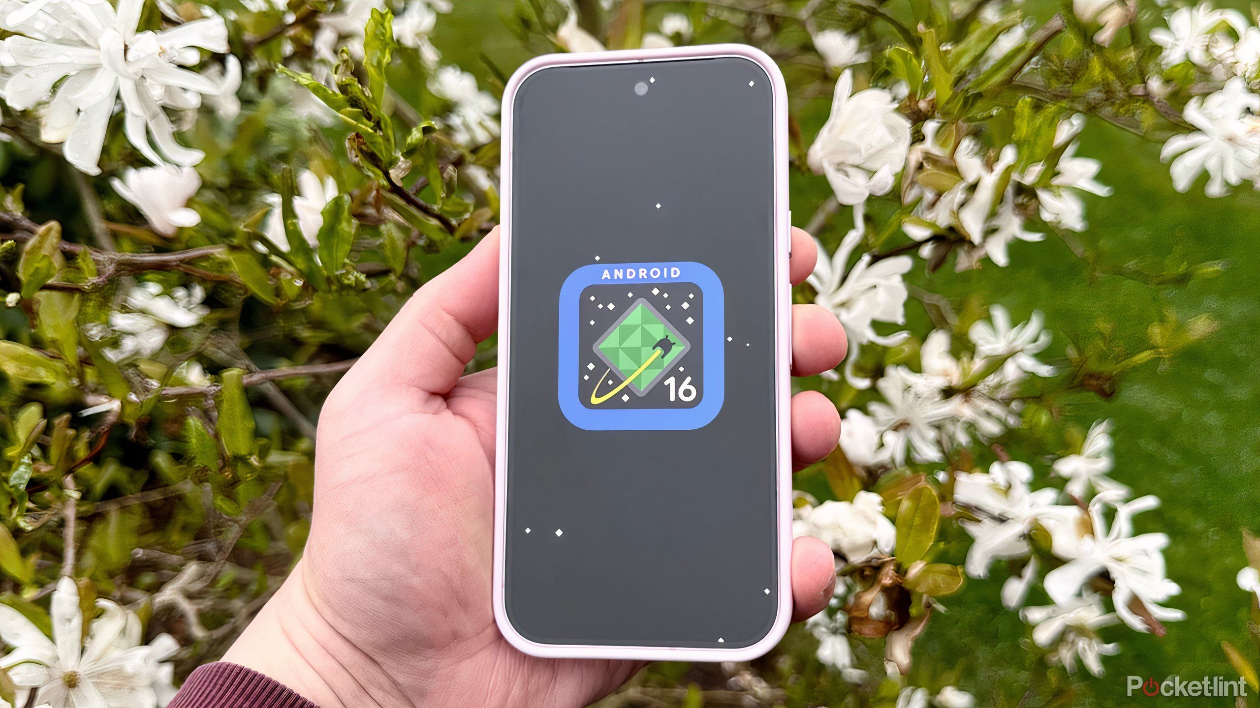
Generally speaking, I’m not a fan of today’s trend of aesthetic homogenization, and I find most third-party Android skins to be far too cheeky in their Apple-inspired UI and UX designs. As such, I was prepared to be disappointed when the time came for me to reboot my Pixel into the Beta 1 build of Android 16 QPR1. After spending a mere five minutes with this new release, however, I can safely say that my initial Material 3 Expressive skepticism was unwarranted.

Related
Google’s new Magic Portrait feature is a Pixel-perfect delight
Bar none, Google’s new Magic Portrait feature is my favorite Material 3 Expressive addition to Android.
Google finally sweats the details
Material 3 Expressive is Android at its finest

I learned the hard way that it’s wrong to judge a book by its cover. As it turns out, when in motion,
Android’s new design language
is actually rather incredible. Unlike with every previous incarnation of Material Design, Google has paid close attention to detail when it comes to the micro-interactions sprinkled throughout the system. The new haptics, the bouncy jiggle physics, and the delightful new animations all come together in a satisfying and cohesive way that makes it a joy to pick up my post-update Pixel.
The strange shape inconsistencies aren’t a problem in the real world, either. In fact, aside from adding some extra visual flair to the mix, they’re designed to improve readability by establishing hierarchy, according to Google. In my case, I’ve already accrued years of Pixel UI muscle memory, but any accessibility enhancements are welcome in my books. Even the interface blur, which I had originally groaned about, turns out to be rather tastefully implemented in person. While it does take a step back in terms of industry uniqueness, I find that it comes together in a way that still feels distinctly ‘
Android
,’
More than ever, I’m happy to have been proven wrong in my initial expression of skepticism.
Interestingly, when enabling power saving mode in Material 3 Expressive, the system reverts to Material You’s opaque and slightly color-tinted surface backgrounds. In a sense, my favorite former aspect of the Pixel UI is still present post-update, albeit only in its
dark mode form
(Google doesn’t allow you to switch to light mode while having power saver on).
I’ve now been using Material 3 Expressive over top of
Android 16
for several days, and I’ve been loving every second of it. I find myself picking up my Pixel out of pure desire to flick through the various revitalized interface elements, taking in all the new animations, fidgeting with the motion physics system, and even
testing out the fun new Magic Portrait
wallpaper feature. As a complete package, and despite still being in its beta testing phase, Android’s new look and feel is a genuine winner. More than ever, I’m happy to have been proven wrong in my initial expression of skepticism.

Related
Google’s big Android redesign is official, and it’s teeming with expression
At its Android Show: I/O Edition, Google has unveiled Material 3 Expressive, the next evolution of Android’s design language.