


You’ve all seen it dozens of times, in banners, posters, trailers, and intro title sequences, that vivid rainbow-like warp field spectrum used in some capacity in nearly every “Star Trek” movie and TV series since it was first adopted for 1979’s “Star Trek: The Motion Picture.”
The latest iteration of this prismatic display appears in episode intros of “Star Trek: Starfleet Academy.” In this new 60th Anniversary tribute to the trademark visual, a parade of notable Federation hero starships is seen blazing new interstellar trails toward new worlds and new civilizations.
Watch On
Sure, this nostalgic birthday animation sequence might be missing a few favorite ships — the USS Cerritos from “Star Trek: Lower Decks”, USS Protostar from “Star Trek: Prodigy”, and USS Enterprise-E from “Star Trek: First Contact” are all absent — but it’s a fantastic way to embrace the franchise’s enduring legacy in an exhilarating manner by lining up this legendary armada.
But what was the origin of this eye-catching, faster-than-light aesthetic, what does it represent, and how has it evolved to become an instantly recognizable part of the “Star Trek” universe? How did Star Trek become synonymous with the rainbow?

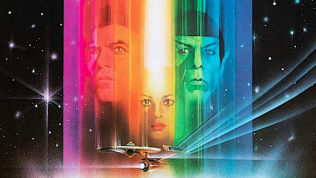
The initial use of what’s now become known as the “rainbow warp effect” was boldly seen in Paramount’s ad campaign and one-sheet movie poster for director Robert Wise’s “Star Trek: The Motion Picture.”
That Christmastime 1979 release, executive produced by “Star Trek” creator Gene Roddenberry, resurrected the live-action “Star Trek” universe after a decade of neglect.
Watch On
Award-winning American movie illustrator Bob Peak designed the iconic rainbow poster for “Star Trek: The Motion Picture,” as well as the stunning one-sheets for “Star Trek II: The Wrath of Khan,” “Star Trek III: The Search for Spock,” “Star Trek IV: The Voyage Home,” and “Star Trek V: The Final Frontier.”
Quite simply, it was a way to represent the visible light spectrum shift that occurred anytime the Enterprise made a warp jump. That warp rainbow caught on and became a trademark element for future “Star Trek” films.
But while the rainbow effect was meant to indicate a warp field, it was also a deliberate design choice to latch onto the popularity of rainbows in pop culture in the late ‘70s and early ’80s.
Whether it was Pink Floyd’s “The Dark Side of the Moon”, the Apple Logo, or the rising use of the rainbow as a symbol for LGBT+ pride, the 70s were all about the rainbow.
Image 1 of 2


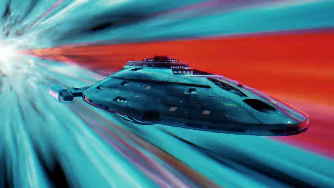
The flashy visuals are a convenient way to remind viewers of the fact that these starships are going really fast and stretching out the visible light as they zoom off. We’re drifting into speculation now, but it could also have been a calculated choice to show up “Star Wars” with a flashier way to signify a starship entering faster-than-light travel.
While the more recent films neglected to use that full shimmering prismatic effect, it’s been formally adopted by Paramount+ for their streaming posters, banners, and thumbnails for each of the six original “Star Trek” films released from 1979 to 1991.
As a final note, it’s worth wondering if the dynamic, multi-hued visual cue isn’t also a respectful nod to the Stargate that Dave Bowman travels through near the end of director Stanley Kubrick’s “2001: A Space Odyssey.”
Whatever the exact reasons for the “Star Trek” optical “rainbow warp effect”, its instant, immersive rush of pure speed visualized remains an integral part of the seminal sci-fi franchise that will continue to live long and prosper.